Website mistakes that cost businesses quote requests
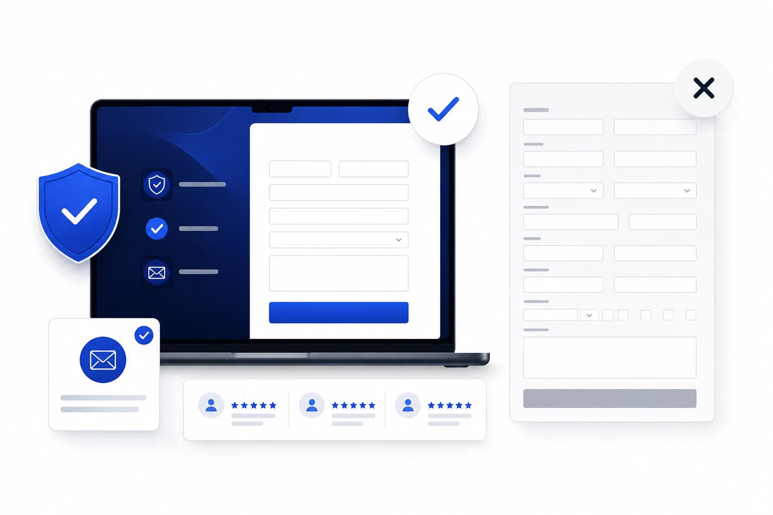
Messaging, navigation, form, mobile and follow-up mistakes that prevent a business website from turning visitors into quote requests.
A quote request is rarely lost because of one dramatic problem. It usually disappears after several small points of friction: a vague heading, an invisible button, proof that appears too late, a difficult form or a confirmation that provides no reassurance. Visitors do not report the problem; they simply close the page or return to search results.
The goal is therefore not to add more elements. It is to remove uncertainty at each step. The following mistakes are particularly expensive for service businesses that depend on calls, appointments and forms.
1. The top of the page does not answer the first three questions
When people arrive, they want to know what the business offers, where it works and why they should continue. A generic slogan or large image without a message forces the visitor to search. The main heading should name the service and desired outcome, while the supporting copy should identify the customer or service area.
This precision also helps search engines understand the page. Google recommends using words people actually use and placing them in important locations such as the main heading, page titles and descriptive links.
2. The call to action promises too little or says too little
A button labelled “Submit” or “Learn more” does not explain what happens next. For a service business, wording such as “Request a quote” or “Book a free consultation” removes uncertainty. The primary button should remain visually dominant and consistent across important pages.
Avoid competing actions in the same area. If the page is meant to generate an inquiry, secondary links should not pull attention away before visitors understand the offer and see enough evidence.
3. Proof appears after the form
Visitors want to verify credibility before sharing contact information. Projects, testimonials, process details, project images, certifications or complete contact details should appear before the first major form, not only on a separate page.
The strongest proof is specific. A short case study that explains the problem, intervention and intended result is more persuasive than a broad claim. When measured results are unavailable, show the quality of the reasoning, work structure and deliverables.
4. The form feels like an interrogation
The W3C notes that people generally prefer short forms and that fields need understandable labels and instructions. For an initial inquiry, collect only what is needed to respond: name, contact method, business, requested service and a short note. Complete project details can be gathered during the call.
Each field should explain the expected format, especially for phone numbers, dates or budgets. Errors should be shown near the affected field with a direct way to correct them. Required fields need to be identifiable before submission.

5. Mobile is treated as a reduced version instead of a complete journey
Google uses the mobile version of content for indexing and recommends keeping essential information equivalent to the desktop version. Yet many websites hide proof, shorten useful content or push the form much farther down on phones.
Test the journey with one hand: read the heading, open the menu, review a project, choose an action, complete the form and view the confirmation. Buttons must be easy to tap, fields should not trigger unexpected zoom and fixed elements must not cover content.
6. Slow loading and visual movement damage trust
Core Web Vitals cover the loading of primary content, responsiveness and visual stability. An oversized hero image, a script that blocks rendering or a button that moves while the page loads can stop an inquiry before it begins.
Measure the pages that receive real traffic and the steps leading to the form. A page may feel fast on a desktop computer while remaining frustrating on a phone and mobile connection. Fix the elements that block reading or clicking first.
7. The confirmation does not explain the next step
After submission, visitors need to know that the inquiry was received, when to expect a response and whether they should check email. A form that simply disappears or a generic message can lead to duplicate submissions or doubts about whether the website worked.
The confirmation should also be accessible and remain visible long enough. For an appointment, state that an invitation was sent. For a quote request, explain the response window and what information may be needed next.
8. Inquiries are not measured correctly
Google Analytics recommends standardized events for lead generation, including generate_lead. When a website measures only page views, the business cannot distinguish a popular page from one that actually produces potential customers.
Measure successful submission rather than the button click alone. Then compare the landing page, source, device and inquiry type. This shows whether the problem is traffic, messaging, the form or sales follow-up.

9. Human follow-up is slower than the website
A form can work perfectly and still lose the sale when nobody responds promptly. Define who receives notifications, who qualifies the inquiry, what response time is acceptable and how follow-ups are recorded. Test emails, invitations and phone numbers regularly.
The website and sales process should be designed as one chain. Optimization does not end at the confirmation message; it ends when the right person takes ownership of the inquiry.
A ten-minute conversion audit
Ask someone who knows little about the business to open the page on a phone and find a way to request a quote. Do not help. Record where the person hesitates, which terms are unclear and what evidence they look for.
Then submit a real test inquiry and verify the confirmation, received email, analytics event and internal follow-up. This test often reveals more useful problems than a long discussion about colours or animations.
A practical next step
Your website gets traffic, but not enough customers?
Ton Premier Site Web can review your message, navigation, mobile experience, forms and conversion tracking to identify what is limiting your inquiries. Book a free website review and receive recommendations adapted to your business.
Frequently asked questions
How many fields should a quote request form contain?
There is no universal number. Keep only the information needed to respond and qualify the first conversation. Detailed project questions can be handled after initial contact.
Where should the first quote request button appear?
The first button should be visible after copy that clearly explains the service. Repeat it after proof, service details and near the end of the page.
How can a business identify the most expensive mistake?
Combine a user test, a real end-to-end submission and analytics data. Fix the blockage that affects the most visitors or completely prevents submission first.
Sources consulted
- Google Search Essentials — Google Search Central
- Forms Tutorial — W3C Web Accessibility Initiative
- Mobile-first Indexing Best Practices — Google Search Central
- Web Vitals — web.dev
- Recommended events for lead generation — Google Analytics Help
Research and writing assisted by artificial intelligence using the cited sources. Published by Ton Premier Site Web.